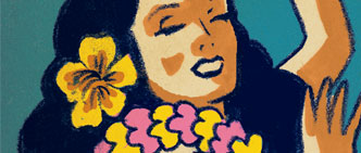
 Package Illustration
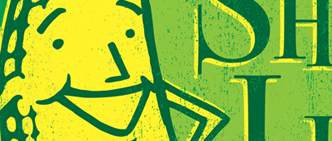
Good packaging should leap off the shelf and grab the consumer's attention. It also needs to stand out from all the other products around it. After spending years doing package design, we have narrowed our focus to creating illustration for all kinds of packaging. We enjoy helping companies set their products apart from their competition by supplying them with vibrant custom artwork tailor-made to elevate their brand's visibilty and image.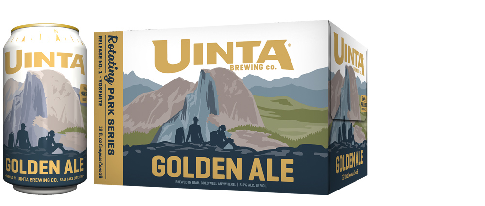 Uinta Brewing Co.
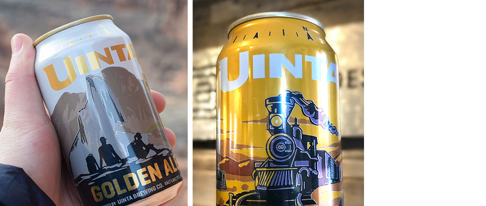
NATIONAL PARKS BEER CANS
Our friends from Utah saw all of our National Parks poster art and asked us to help them create a line of beer cans and boxes that would celebrate several iconic parks.
Illustraions by Aaron Johnson
Art Direction by Joel Anderson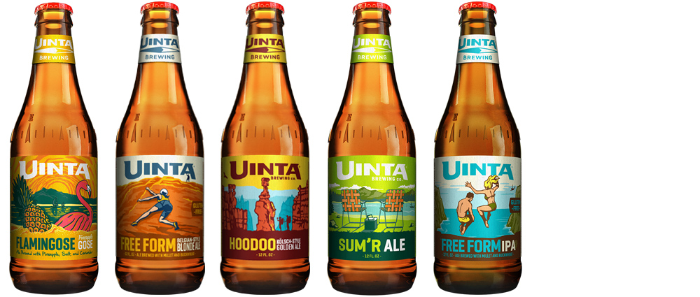 Uinta Brewing Co.
BEER BOTTLE LABELS
We have illustrated dozens of beer labels for Uinta. Each flavor of beer has a unique personality and flavor profile. After sampling each one, we created art that would evoke the flavor and feel of each beer.
Illustrations by Aaron Johnson
Art Direction by Joel Anderson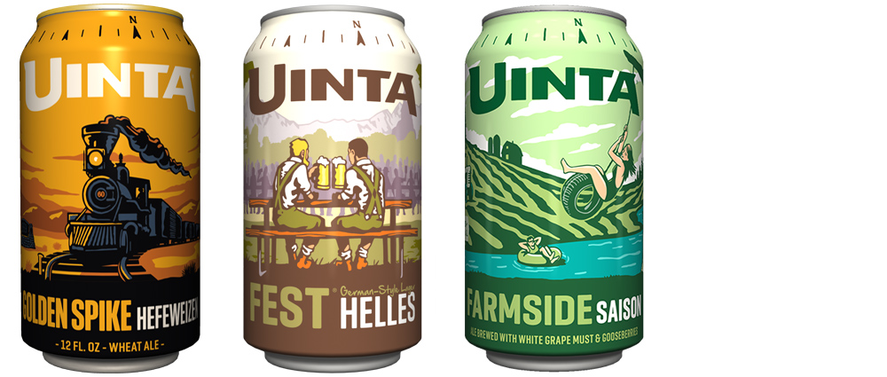 Uinta Brewing Co.
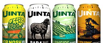
BEER CAN ART
Beer cans offer more space for art than beer bottle labels. But unlike bottle labels which are printed with 4-color process inks, they can only be printed in a limited number of colors. This presents some fun challenges—somehow, we need our art to tell the story in 7 colors or less!
Illusttrations: Aaron Johnson & Joel Anderson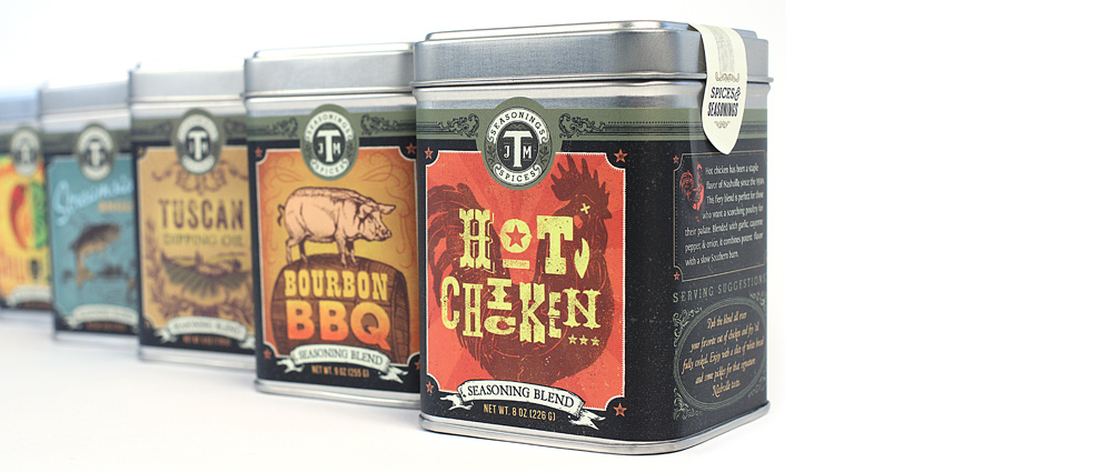 J.M. Thomason Spices
SPICE & SEASONING PACKAGING
The Doug Jeffords Company has been selling quality commercial spices and seasonings to restaurants for years. When they decided to create the J.M Thomason line of consumer spices, they hired us to retool their branding and create a new line of retail packaging.
Designer: Ligia Teodosiu
Illustrator: Aaron Johnson & Ligia Teodosiu
Creative Director: Joel Anderson
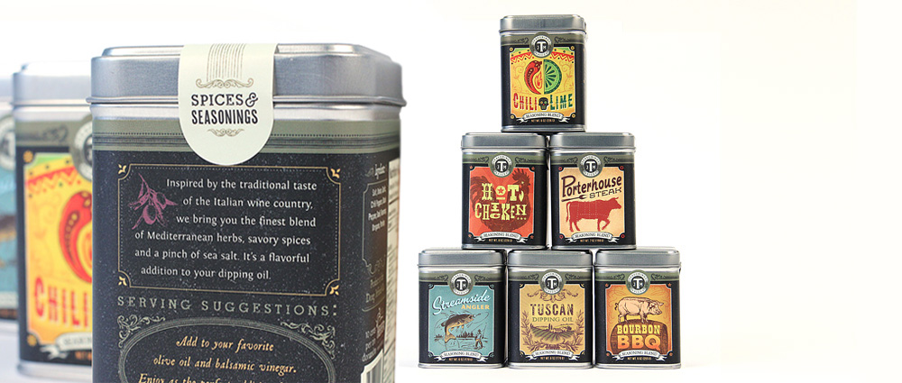 J.M. Thomason Spices
SPICE & SEASONING PACKAGING
The challenge (and the delight) of this packaging scheme is the unique spot illustration, hand-lettering and color palette for each new flavor. We created a different piece of art for each spice to convey the flavor profile, best culinary use and lifestyle vibe of each one.
Designer: Ligia Teodosiu
Illustrator: Aaron Johnson & Ligia Teodosiu
Creative Director: Joel Anderson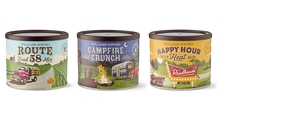 Williams Sonoma
GOURMET FLAVORED NUTS
Williams Sonoma hired us to create illustrations for a collection of flavored nuts.The artwork wrapped around each tin and conjured up a different vibe for each flavor using vintage look with a limited color palette.
Illustrator: Aaron Johnson
Creative Director: Joel Anderson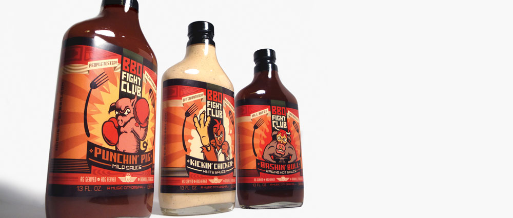 Hog Heaven
BBQ FIGHT CLUB SAUCE BOTTLES
The legendary Music City BBQ joint Hog Heaven wanted to start bottling their famous sauces and selling them in stores. So they asked us to help them create a brand that would play up the name. We created eye-catching lable art with barnyard brawl characters so the branding would be as butt-kickin’ as the sauces. This label series won a Gold ADDY Award and has been featured on The Dieline.
Designer: Andy Gregg
Creative Director: Joel Anderson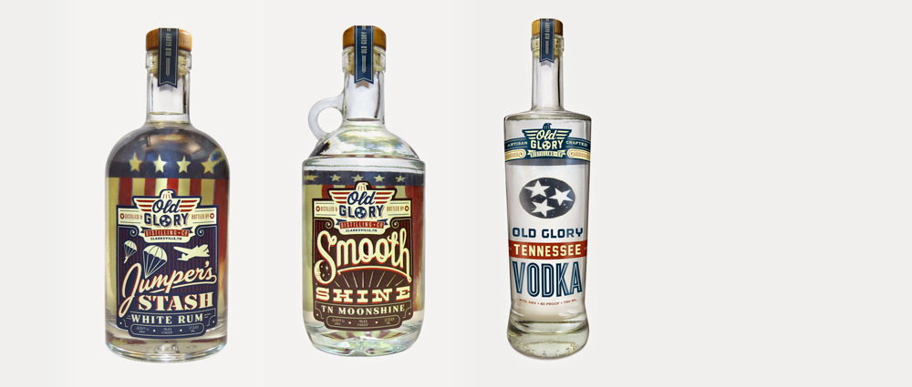 Old Glory
BEVERAGE LABEL DESIGN
In addition to developing a brand identity for Old Glory, we also provided package design for their distilled spirit products. We started by helping choose bottles that would be appropriate for each different product. Then we created some beautiful, vintage hand-lettering, adding lots of intricate scrolling and line art to achieve a historic feel for each label.
Designer: Aaron Johnson
Creative Director: Joel Anderson True South Puzzle Co.
PUZZLE PACKAGING
How do you design a puzzle box so that it looks different from all the other puzzle products out there? You go Southern and artisnal with the whole thing. To achieve this look, we did a lot of hand-lettering and made space for our illustration to be the hero.
Design & Lettering: Ligia Teodosiu
Illustration: Matt Lehman
Creative Direction: Joel Anderson
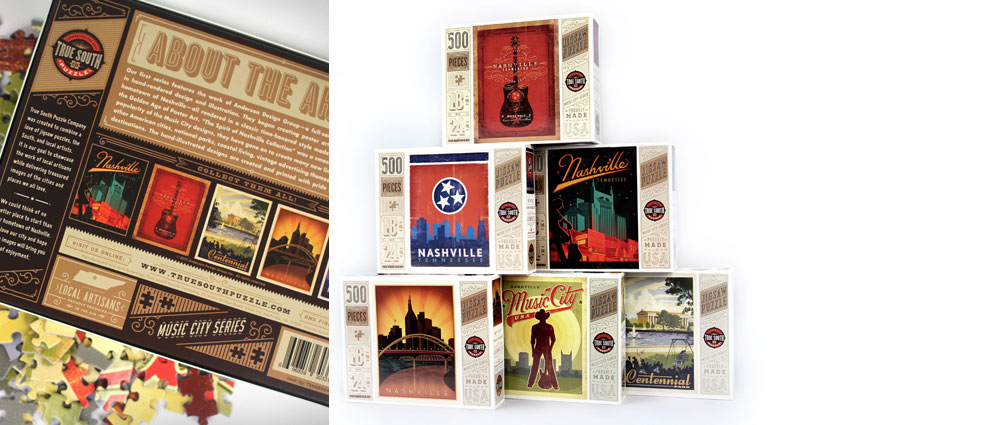 True South Puzzle Co.
PUZZLE PACKAGING
We licensed our Spirit of Nashville art to the puzzle company to give them their first 6 designs. They have since added other designs by other Southern artists.
Creative Director: Joel Anderson
Designers: Ligia Teodosiu
& Ryan Bosse
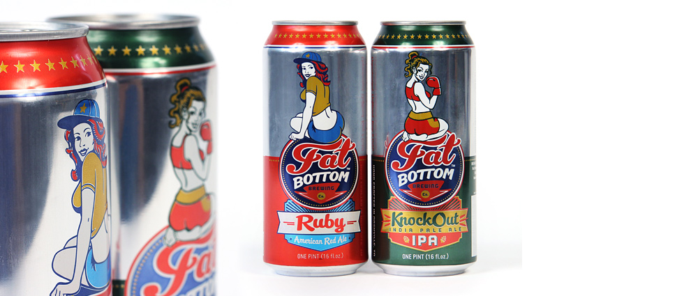 Fat Bottom Brewing
CRAFT BEER CAN DESIGN
We created the logo and branding for Fat Bottom Brewing Co. When they were ready to start canning to sell beer in stores, they called on us to design their cans. Starting with 2 flavors, we created a master packaging scheme/color palette and we illustrated a different girl to go with each flavor.
Design & Creative Direction: Joel Anderson
Illustration: Aaron Johnson & Ligia Teodosiu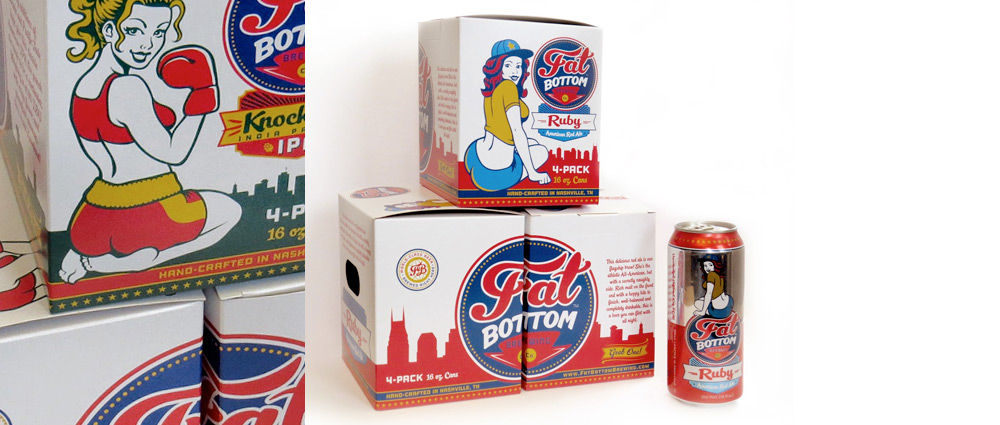 Fat Bottom Brewing
CRAFT BEER CAN DESIGN
Once the aluminum can designs were finalized, we created a packaging concept that would allow each square box to be stacked or displayed in a number of ways so stores could create different scenes or even an entire wall of Fat Bottom Girls. While we no longer do package design, we still love to do artwork for packaging like this!
Illustration & Design: Aaron Johnson
Creative Direction: Joel Anderson
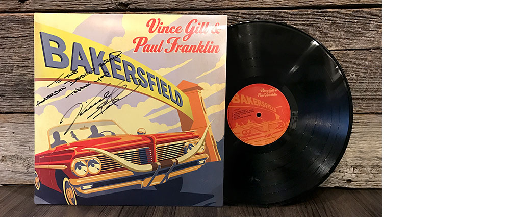 Bakersfield
ALBUM COVER ILLUSTRATION
In 2013 MCA Records hired us to do an illustrated cover for Vince Gill's new tribute album Bakersfield, featuring Paul Franklin. The album was a tribute to iconic musicians Buck Owens and Merle Haggard, who hail from Bakersfield, CA. We used a vintage poster art technique to render the iconic sign on the edge of town.
Illustrator: Aaron Johnson
Creative Director: Joel Anderson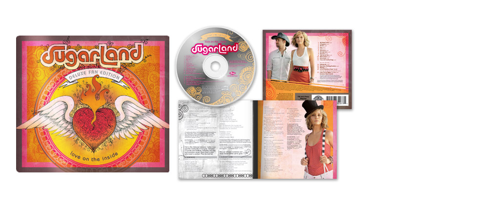 Sugarland
ALBUM COVER DESIGN
Mercury Records called in a panic one day. They had gone through dozens of cover concepts and Sugarland was still not seeing a winner. With the deadline looming, Joel got out a ball-point pen and started doodling. After applying a wash of color to his line art, Sugarland was pleased to sign off on a cover design. Within a few days, the entire CD package was done. Sometimes, it’s best not to over-think a project!
Illustrator: Joel Anderson